Make a color palette by drawing a curve
Draw a curve across the color area. Curve Palette picks colors along that curve and turns them into a palette.
Open the tool →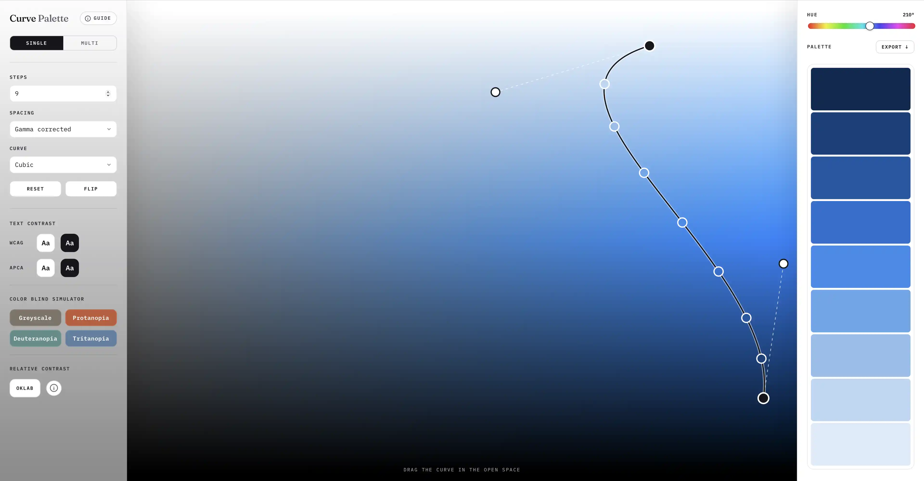
Draw a curve across the color area. Curve Palette picks colors along that curve and turns them into a palette.
Open the tool →
The canvas is a color area. Move left or right to change the color strength. Move up or down to make it lighter or darker. The colors under the curve become your palette.
Choose Single or Multi at the top left of the tool.
Single makes lighter, darker, softer, and stronger versions of one color. Use it for a set of shades in an app or website.
Multi makes a palette from several colors. Choose the color range and strength, then shape the palette with the curve.
The dots show where each color is picked from the curve. The spacing option changes where those dots sit.
Spaces the dots so the change from one color to the next looks even. This usually gives the smoothest result, so it is the default.
Places the dots at equal distances along the curve. The colors may not always look evenly spaced.
Lets you drag each dot to the exact place you want on the curve.
Use Steps to choose how many colors you want. Choose Cubic for two curve handles or Quadratic for one. Use Flip to reverse the palette.
Turn on these views to check whether your colors are clear and easy to use.
See how white or black text looks on each color. WCAG and APCA scores help you find colors that make text easy to read. A higher score means stronger contrast.
Preview how your palette may look to people with different types of color blindness. You can choose more than one view to compare them.
This view compares each color with the one next to it. The colored dots show how large each change is:
Click a color to copy its hex code. To save the full palette, open Export and choose a HEX list, CSS variables, a Tailwind scale, or JSON.
Curve Palette runs in your browser. Your colors are not uploaded. After the page has loaded once, you can also use it without an internet connection.
Each example below was made with one curve. Use them as a starting point.
Keep the curve near the grey side to make soft, slightly colored greys for backgrounds, borders, and text.
Start with a very light color and move toward a deep, strong color to make a full set of shades for an app or website.
Move from light to dark to show low and high values clearly in a heatmap.
Move from yellow to dark red to show warning levels, risk, or urgency.
Keep the curve near the light end to make soft colors for tags, backgrounds, and illustrations.
Draw across several colors at a similar brightness to make clear choices for charts, labels, or groups.